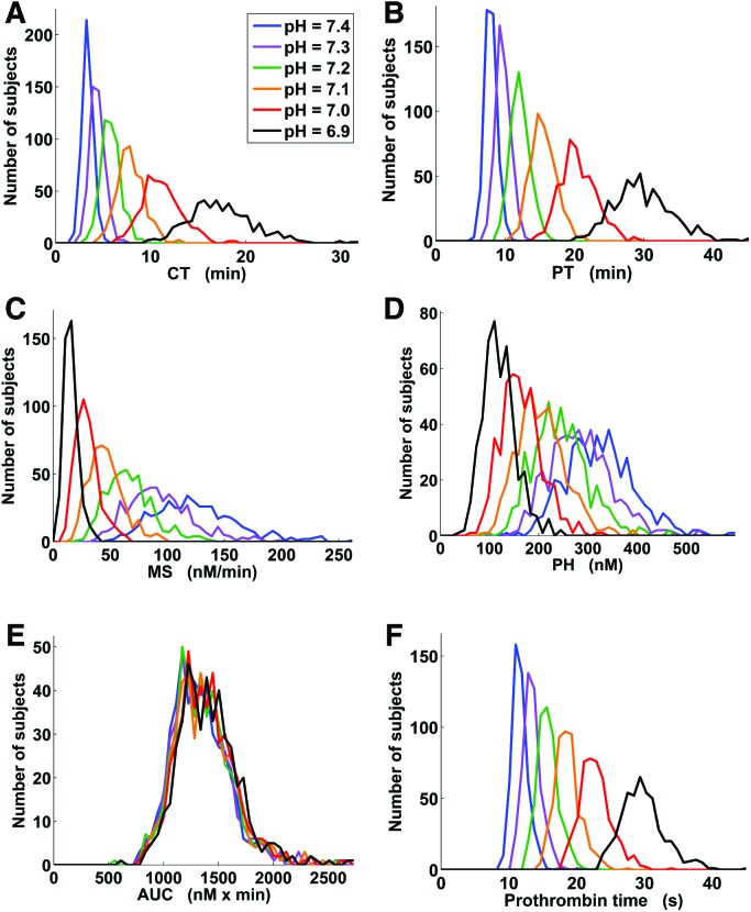
Figure 6.
Thrombin generation parameter distributions (including prothrombin time) in the virtual Leiden Thrombophilia Study (LETS) subject group for different pH levels. The plots show distribution histograms generated using the MATLAB function HIST with 50 bins splitting up the interval between 0 and the maximum value for a given thrombin generation parameter. CT = clotting time; PT = thrombin peak time; MS = maximum slope of the thrombin trajectory; PH = thrombin peak height; AUC = area under the thrombin trajectory (or “curve”).

