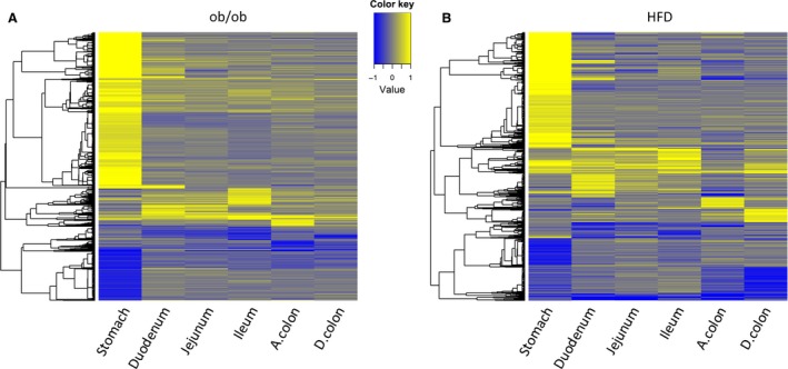
Figure 2.

(A) Heat map of 1263 differentially expressed genes across different tissues, comparing ob/ob versus ob control samples. The log2 fold‐change profile between ob/ob versus ob control samples for each tissue is used for plotting. (B) Heat map of 926 differentially expressed genes across different tissues, comparing HFD versus normal diet samples. The log2 fold‐change profile between HFD versus control samples for each tissue was used for plotting. Yellow denotes up, and blue denotes downregulation in ob/ob or HFD. Genes and samples are represented by rows and columns, respectively. Genes with FDR < 0.1 and absolute fold‐change > 1.5 in any tissues are shown in the heat map and are clustered by hierarchical clustering.
