
Figure 15.
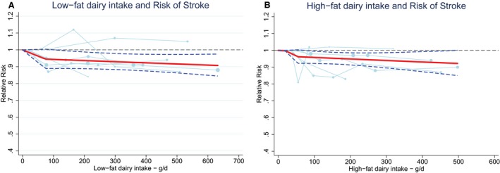
Ding's spaghetti plots for (A) the nonlinear association (P for nonlinearity=0.01; knot at 75 g/day) between low‐fat dairy intake and total stroke (n=6) and (B) the nonlinear association (P for nonlinearity=0.01; knot: 55 g/day) between high‐fat dairy intake and total stroke (n=6). Light blue lines represent Western studies. The circles are placed at the study‐specific relative risks that are related to the corresponding quantity of intake. The area of the circles is proportional to the study‐specific statistical weight. The solid red line represents the pooled relative risk at each quantity of intake and the 2 dashed dark blue lines the corresponding 95% CI.