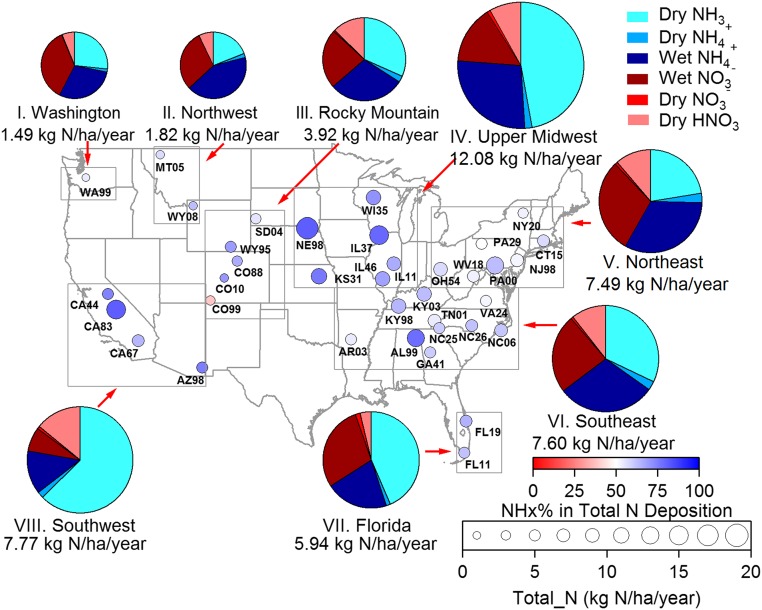
Fig. 5.
Spatial trends in total reactive inorganic N deposition across the United States from July 2011 to June 2013. Fractional reduced N contributions to total N deposition (dry + wet) at the 37 sites are represented by circle color. The total inorganic nitrogen deposition is indicated by circle size. The pie charts show average fractional contributions of individual reduced and oxidized N deposition pathways for the eight regions, with each pie area proportional to the average total inorganic nitrogen deposition (also listed under each pie).

