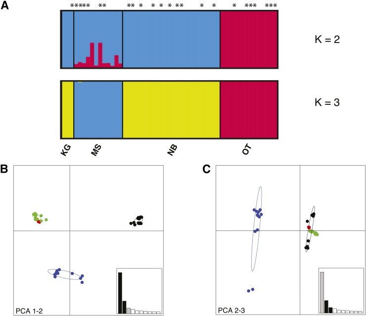
Figure 2.
Population structure in Glossina fuscipes fuscipes (Gff) from Uganda. (A) Genetic membership bar plot based on the 47,997 SNPs that met HWE expectations after BH correction obtained using fastStructure (Raj et al. 2014). Each vertical bar represents a single individual. The height of each color represents the probability of assignment to each of K clusters. Individuals infected with Trypanosoma are indicated with and asterisk (*). Plots of K = 2 and K = 3 are shown for all sampled flies in all four populations (N = 53). (B)–(C) Principal component analysis (PCA) plots of Gff populations based on all 73,297 SNPs. Each dot represents an individual. The 95% inertia ellipses are shown for each population. (B) PC1 vs. PC2. (C) PC2 vs. PC3. Locations are identified by different colors. Variance explained by the different components = PCA1: 0.3%, PCA 2: 0.09%, PCA3: 0.04%. KG, Kalangala Island (Red); MS, Masindi (Blue); OT, Otuboi (Black); and NB, Namutumba (Green).

