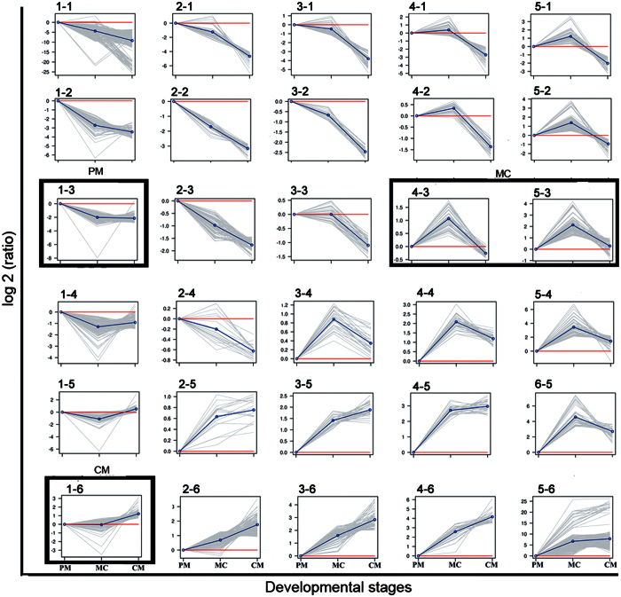
Figure 5. Clustering profiles.
Plots of SOM profiles of the reduced set with their centroids highlighted in blue. Four clusters that were further analyzed for stage-specific expression patterns are marked in black boxes. The vertical axis represents the relative gene abundance, and the horizontal axis shows the three developmental stages.

