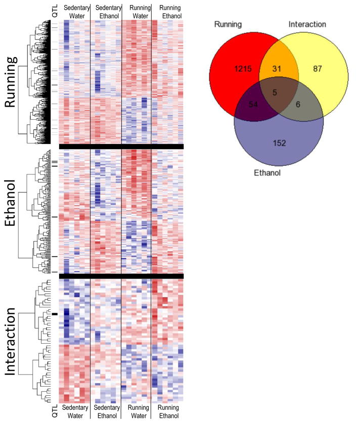
Figure 2.
Heatplots and dendrograms generated from log2 count per million expression of differentially expressed genes (DEGs) across all four groups of mice (n=6/group). The three heatplots show genes differentially expressed due to a main effect of wheel running, ethanol consumption and the interaction of wheel running and ethanol consumption. Red signifies higher expression, blue denotes lower expression values. Genes residing within ethanol-related quantitative trait loci are shown with a black bar next to heatplot. The Venn diagram displays the overlap between genes in each group.

