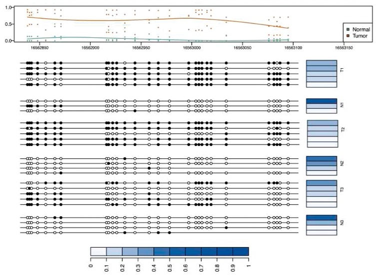
Fig. 6.

Differentially methylated region between colon tumors and matched normal pairs with corresponding patterns and their abundances across different samples. The top panel shows the marginal methylation percentage and the average curve of marginal methylation percentage as estimated by bumphunter. The bottom panel depicts the methylation patterns of samples. Blue bars represent the abundance of corresponding patterns. The abundances are normalized by sum of the abundances of all patterns in selected region
