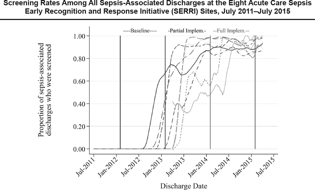
Figure 2.
Time lines, generated using lowess smoothing of screening rates with a bandwidth of 0.10, represent the proportion of sepsis-associated discharges that had at least one sepsis screen performed during the encounter. As shown in the figure, by January 2015, except for the two new sites that joined in mid-2014, all the acute care SERRI sites were screening more than 80% of inpatients whose stay was sepsis-associated. the denominators were all sepsis-associated discharges at participating hospitals during the time points, regardless of whether the stay occurred on a unit targeted for SERRI participation.

