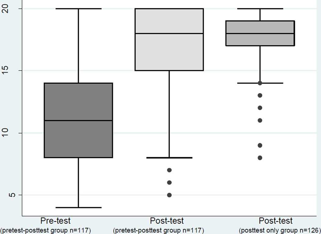
Fig 1. Distribution of Pretest and Posttest scores.
In this box chart, the length of each box represents the interquartile range, and the horizontal line inside the box represents the median. The “whiskers” represent the upper and lower bounds of the data. The dots represent outliers, or anything greater or less than 3/2 the interquartile range.
There is a significant improvement in test scores after the intervention (p<0.001). There is no significant difference in posttest scores between those who had heard of cervical cancer before the intervention (pretest-posttest group) and those who had not (posttest-only group).

