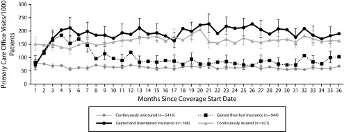
FIGURE 1—
Comparison of Monthly Primary Care Utilization Rates in the 3 Years After the Oregon Experiment, by Insurance Group, 2008–2011
Note. Rates averaged over each 1-month interval and adjusted for patient gender, age, race/ethnicity, chronic conditions, health center, and household income. Vertical bars denote 95% confidence intervals of monthly utilization rate.

