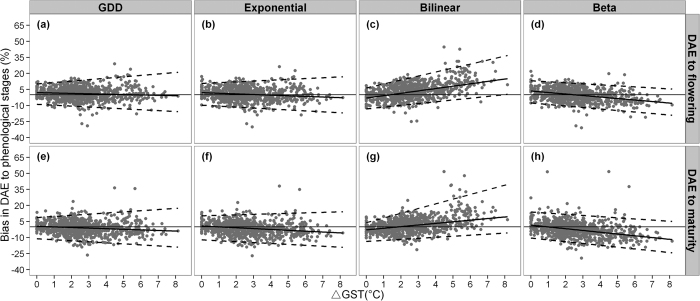
Figure 8. Bias between simulated and observed DAE to flowering and maturity (right y-axis) expressed per ΔGST for each of the four phenology models (upper x-axis) when all data were used for calibration.
Solid lines represent the 0.5 percentile regression line, and the lower and upper dashed lines represent the 0.025 and 0.975 percentile regression lines.

