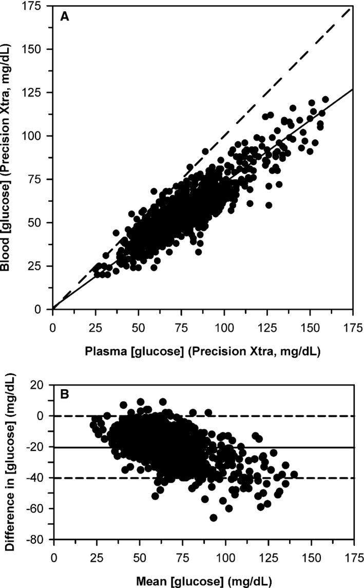
Figure 4.

(A) Scatterplot indicating the relationship between plasma glucose concentration ([gluc]) and blood [gluc] measured by an electrochemical point‐of‐care meter for 1,109 blood samples from 106 periparturient Holstein‐Friesian cattle. The dashed diagonal line is the line of identity, and the thick line is the line of best fit from Deming regression. (B) Bland–Altman plot of the difference between plasma [gluc] and blood [gluc] measured by the meter against the mean [gluc] for both methods. The solid horizontal line is the mean bias and the two horizontal dashed lines represent the 95% confidence interval for agreement. The plot indicates that bias decreased linearly as mean [gluc] increases.
