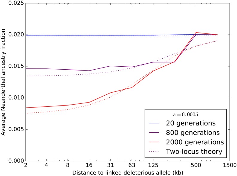
Figure 7.
Each colored curve plots the average fraction of Neanderthal ancestry after T generations of admixture ( 800, or 2000) as a function of distance from an introgressed deleterious mutation, assuming an additive model of dominance effects. Solid lines show simulation results averaged over 300 SLiM replicates. For each time point, a dotted line of the same color as the simulation line shows the Neanderthal ancestry fraction profile that is predicted by Equation 2.

