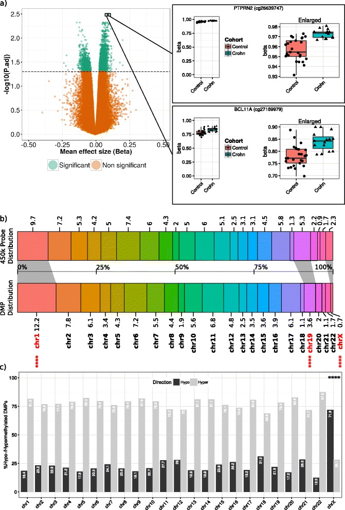
Fig. 3.

Differentially methylated positions. a Left: Volcano plot of the –log10 transformed BH-adjusted p on the Y-axis versus the mean effect size in methylation (beta) on the X-axis. DMPs are indicated in green. Right: Dot-boxplots of the two most significant DMPs: cg26639747 (PTPRN2) and cg27159979 (BLC11A). b Comparison of the probe distribution on the 450k versus the DMP distribution per chromosome where the different colors represent the different chromosomes. The numbers along the barplot represent the percentages of the 450k probes (top) or DMPs (bottom) per chromosome. Significantly different DMP distributions are indicated in bold red with the asterisks indicating the level of significance as found in Additional file 5: Table S3 (*p < 0.05, **p < 0.01, ***p < 0.001, ****p < 0.0001). c For each chromosome, the percentage hypo- and hypermethylated DMPs is indicated with barplots in black and gray, respectively
