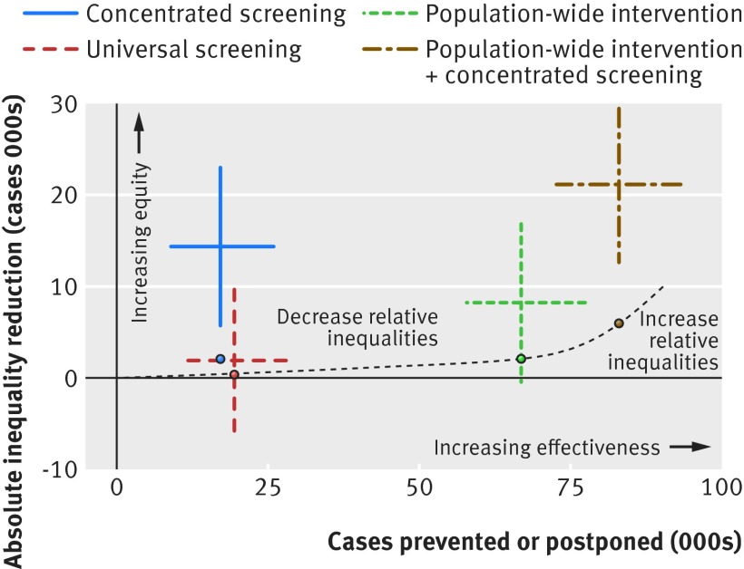
Fig 2 Equity summary chart of effectiveness and equity of all modelled interventions, compared with baseline scenario (beginning of axes). Dashed line represents “equity” curve. Interventions below the curve increase relative inequality, whereas interventions above it decrease relative inequalities. Smaller coloured dots represent reference points used to fit equity curve. Horizontal and vertical error bars represent interquartile ranges

An official website of the United States government
Here's how you know
Official websites use .gov
A
.gov website belongs to an official
government organization in the United States.
Secure .gov websites use HTTPS
A lock (
) or https:// means you've safely
connected to the .gov website. Share sensitive
information only on official, secure websites.
