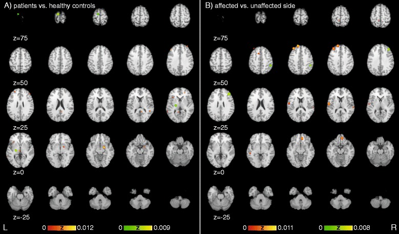
Fig. 2.

Significant areas of experiments showing differences between a) patients and healthy controls as well as differences between the b) affected versus the unaffected side sorted along the Y-axis of the Talairach space representing the dorsoventral-axis. Red heat map represents increased activation in patients or affected side, green heat map represents decreased activation in patients or affected side in comparison to control group or unaffected side respectively
