
Figure 3.
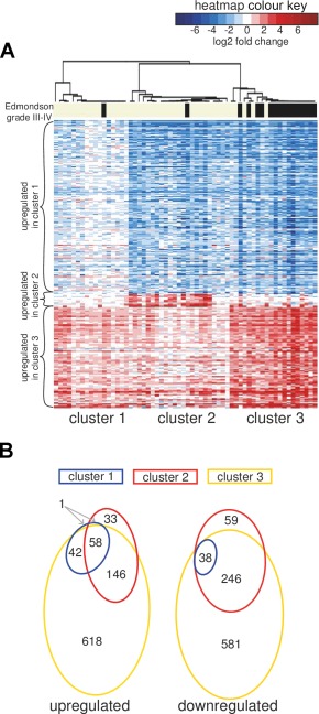
Including normal control samples changes the interpretation of gene expression‐based subclasses. (A) Heatmap representation of changes in gene expression as in Figure 1A, but using the expression data scaled with respect to the mean of normal liver tissue samples. The heatmap colours represent log2 fold change values in the tumour compared to the mean of 5 normal liver samples (shades of red indicate the genes upregulated with respect to the normal liver, while blue indicates downregulation). (B) Venn diagrams showing the overlap in the sets of genes significantly dysregulated in each HCC cluster compared to the reference set of normal liver tissue samples (>2‐fold, FDR < 0.01).