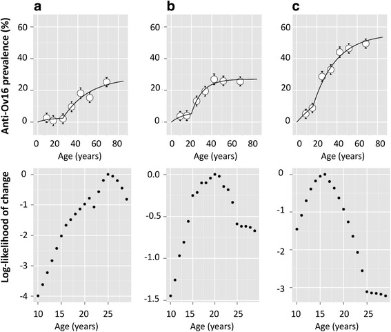
Fig. 6.

Seroprevalence against age, for the three village clusters described in Fig. 4. Two FOI curves were fitted to each cluster’s seroprevalence plot. Graph a shows FOI fits for villages with < 15 % overall seroprevalence; b shows FOI fit for villages with 15–20 % seroprevalence; and c shows FOI fits for villages with > 20 % seroprevalence. The bars for each point represent the standard deviation. The likelihood of change with respect to age, informing the FOI fits, are shown below the seroprevalence plot for each respective village cluster
