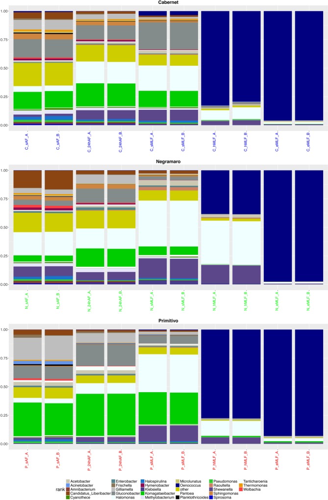
Fig 5. Stacked box-plot of relative taxa abundances.
Stacked box-plot displaying the relative abundances of the taxa (≥1%). In particular, a specific plot was produced for each wine variety (Cabernet, Negramaro, and Primitivo) to describe the changes in genera abundance at the five time points (sAF, 24hAF, sMLF, hMLF, and eMLF). Taxa for which the relative abundance was less than 1% were grouped and named “others” in the graph.

