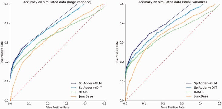
Fig. 3.
Differential testing evaluation. Testing accuracy for four different methods (SplAdder + GLM, SplAdder + rDiff, rMATS and JuncBase; see legend). Each plot represents a different test set. The plot shown on the left represents the sample dataset with large biological variance between replicates, whereas the plot on the right is based on the sample set with small biological variance between replicates. The dashed line represents the diagonal and reflects the performance of a random assignment of classes (Color version of this figure is available at Bioinformatics online.)

