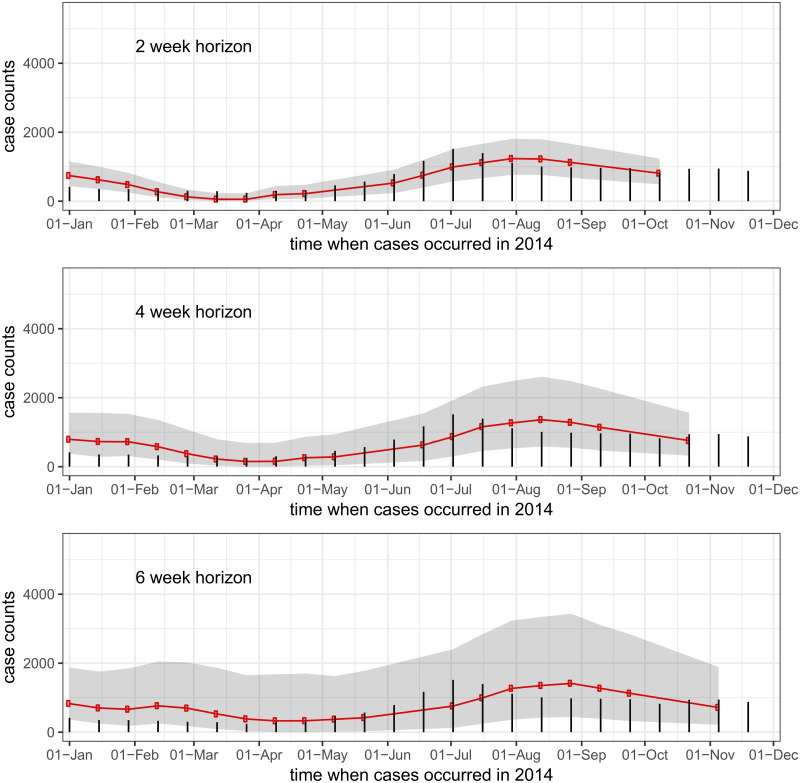
Fig 3. Country-wide real-time predictions for incident dengue hemorrhagic fever.
Red lines show predicted case counts, black bars show cases reported by the end of the 2014 reporting period. The three figures show (top to bottom) one-, two-, and three-biweek ahead predictions. So, for example, every dot on the top graph is a one-biweek ahead real-time prediction made from all available data at the time of analysis.

