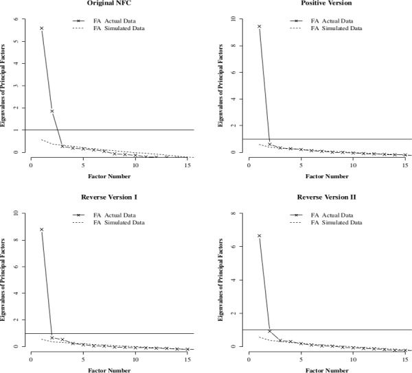
Fig 1. Parallel analyses for the four version of the NFC scale.

In each graph, the horizontal line indicates the eigenvalue of one. The straight line is the scree plot obtained from the data. The dashed line is an average scree plot obtained from simulated dataset with the same dimension as the original dataset but generated from a population where all variables are uncorrelated.
