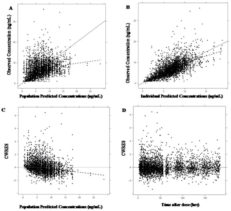
Figure 1. Goodness of fit plots for the final tacrolimus model.

(A) observed concentrations (ng/mL) vs population predicted concentrations (ng/mL) and (B) observed conc. (ng/mL) vs individual predicted concentrations (ng/mL). The black dots represent the observed tacrolimus trough concentrations, the solid line represents the line of unity and the dashed line represents the loess smooth.
(C) conditional weighted residuals (CWRES) vs population predicted concentrations (ng/mL) and (D) CWRES vs time after dose (hrs). The dots represent the observed tacrolimus trough concentrations, the solid line is the line at y=0 and the dashed line represents the loess smooth.
