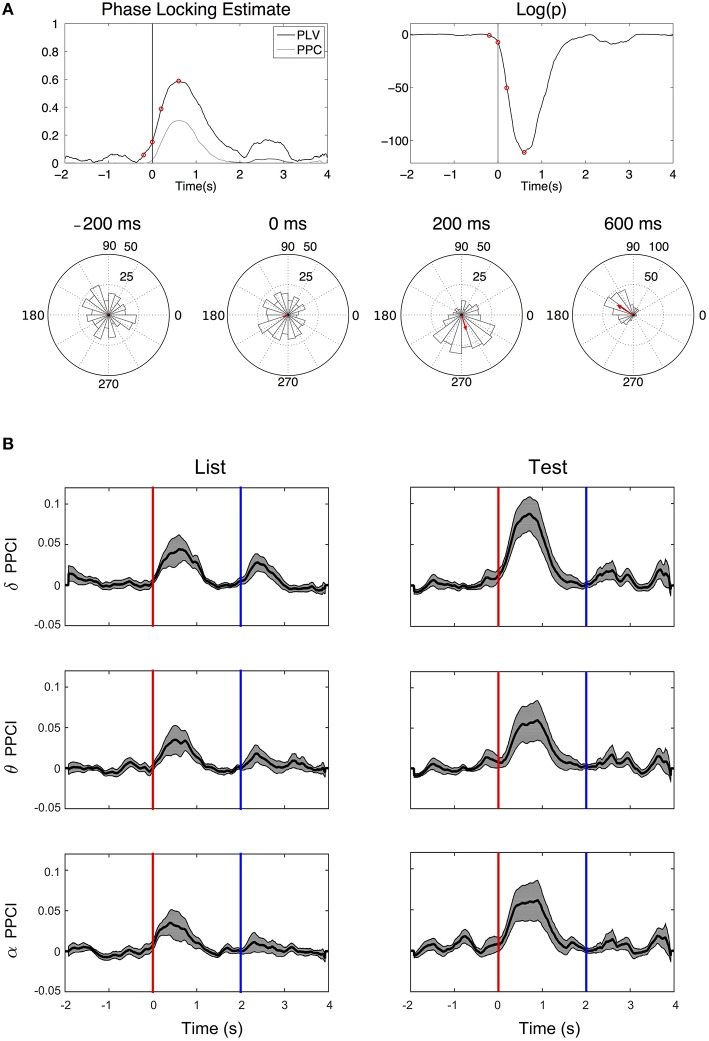
Figure 5.
Phase reset. (A) Top left: Time progression of the PPCI and phase locking value (PLV derived from Rayleigh statistics). Top right: log of the significance p-value (top right) of hippocampal EEG filtered in the delta range amongst trials for a single patient from a single electrode. Time 0 corresponds to stimulus presentation (“Test”). Bottom circular histograms show phase histograms at different times around stimulus presentation (red circles on the PPCI plots). Red arrows correspond to the mean phase vectors. Here, phase 0 corresponds to the peak of the oscillation (3 o'clock on the trigonometric circle by convention). (B) Progression of mean PPCI (±sem) averaged across patients and electrodes in delta (δ), theta (θ), and alpha (α) relative to “List” (left) and “Test” (right) stimulus presentation. Red line: time of stimulus onset. Note also the presence of phase reset at the time when the stimulus is removed from the screen (Blue line).

