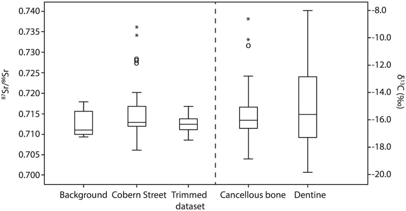
Fig 3. Tukey’s schematic boxplot showing 87Sr/86Sr variation for the background data (n = 18: Sealy et al. [69] and Balasse et al. [68]), the (trimmed) Cobern Street data (this study), and the variation in δ13C for the dentine (n = 36) and cancellous bone (n = 50) samples from Cox et al. [21].
Key: the boxes represent the interquartile range (IQR: Q3-Q1), the central line indicates the median. The whiskers represent Q1–1.5*IQR and Q3 + 1.5*IQR. The circles represent mild outliers (>1.5*IQR), the asterisks extreme outliers (>3*IQR). The trimmed dataset resembles a normally distributed dataset in which the statistical outliers are excluded.

