
Figure 3. Bi-plot for grain yield.
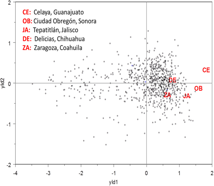
The red codes represent each of the sites. The points represent each of the lines. The lines closest to the end of the site vector are the best performing lines for that specific site.
Official websites use .gov
A
.gov website belongs to an official
government organization in the United States.
Secure .gov websites use HTTPS
A lock (
) or https:// means you've safely
connected to the .gov website. Share sensitive
information only on official, secure websites.
The red codes represent each of the sites. The points represent each of the lines. The lines closest to the end of the site vector are the best performing lines for that specific site.