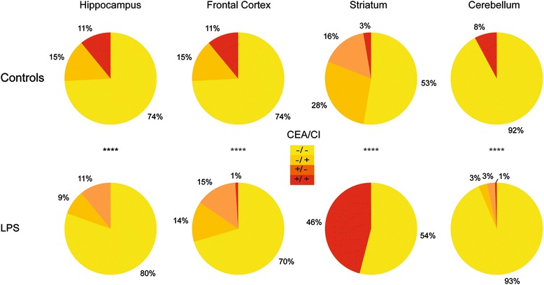
Fig. 5.

Highlighting sub-populations by region. The pie charts represent the proportions of sub-populations defined by the cutoff previously described in Fig. 4 by region of interest and by condition: in yellow, sub-population with low CEA and low CI (−/−); in orange, sub-population with low CEA and high CI (−/+); in dark orange, sub-population with high CEA and low CI (+/−); and in red, sub-population with high CEA and high CI (+/+). Chi-square test was used to compare the control and the LPS group. ****p < 0.0001
