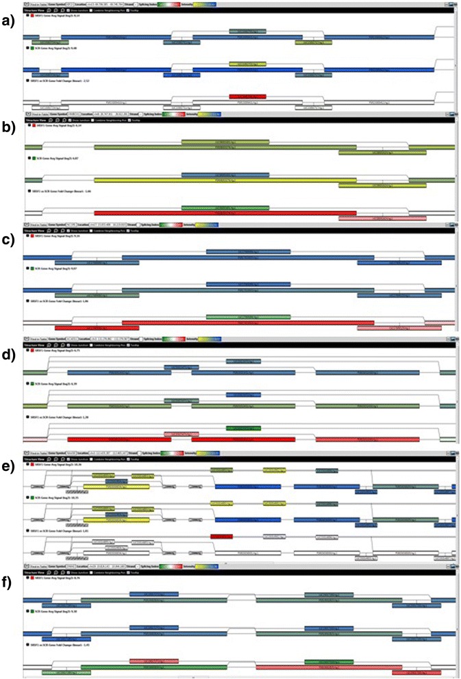
Fig. 7.

TAC view of six of the compared events. In each of the panels, there are three representations of the splicing graph for each gene. The first one represents the measured expression for each probeset (shown as filled rectangles, yellow: low expression, blue: high expression) in samples treated with SRSF1, the second one represents the expression in the samples treated with scramble siRNA (same color code) and the third one represents the splicing index for each probeset (red: overexpressed, green: underexpressed)
