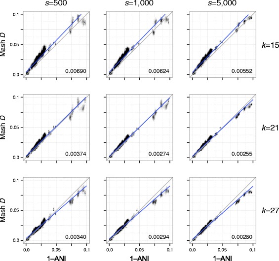
Fig. 2.

Scatterplots illustrating the relationship between ANI and Mash distance for a collection of Escherichia genomes. Each plot column shows a different sketch size s and each plot row a different k-mer size k. Gray lines show the model relationship D = 1–ANI and numbers in the bottom right of each plot give the root-mean-square error versus this perfect model. Blue lines show linear regression models. Increasing the sketch size improves the accuracy of the Mash distance, especially for more divergent sequences. However, there is a limit on how well the Mash distance can approximate ANI, especially for more divergent genomes (e.g. ANI considers only the core genome)
