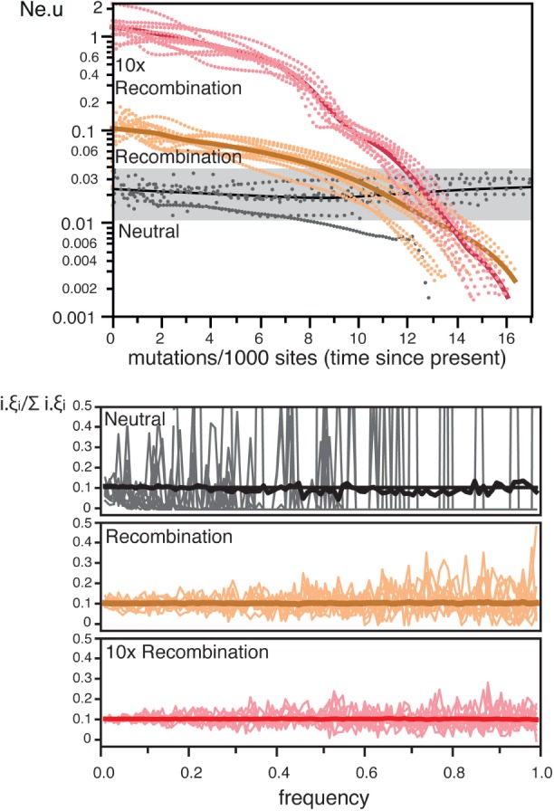
Fig. 1.

The effect of recombination on skyline plots and SFS. The simulations used the E. coli population parameters (Recombination), ten times higher recombination rates (10× Recombination), or no recombination (Neutral). Top The simulations in the skyline plots are represented as dotted lines. The thick lines represent the smooth kernel fit (resp. R2 = 0.81, R2 = 0.87, and R2 = 0.38). Bottom. SFS (distribution of the frequencies of all nucleotide polymorphisms in the sample) for each condition. The thick line indicates the average SFS over 1,000 replicates whereas the thin shaded lines are the observed SFS for ten random replicates. All SFS were transformed and normalized (see section “Methods”). Colors match the same datasets in both plots.
