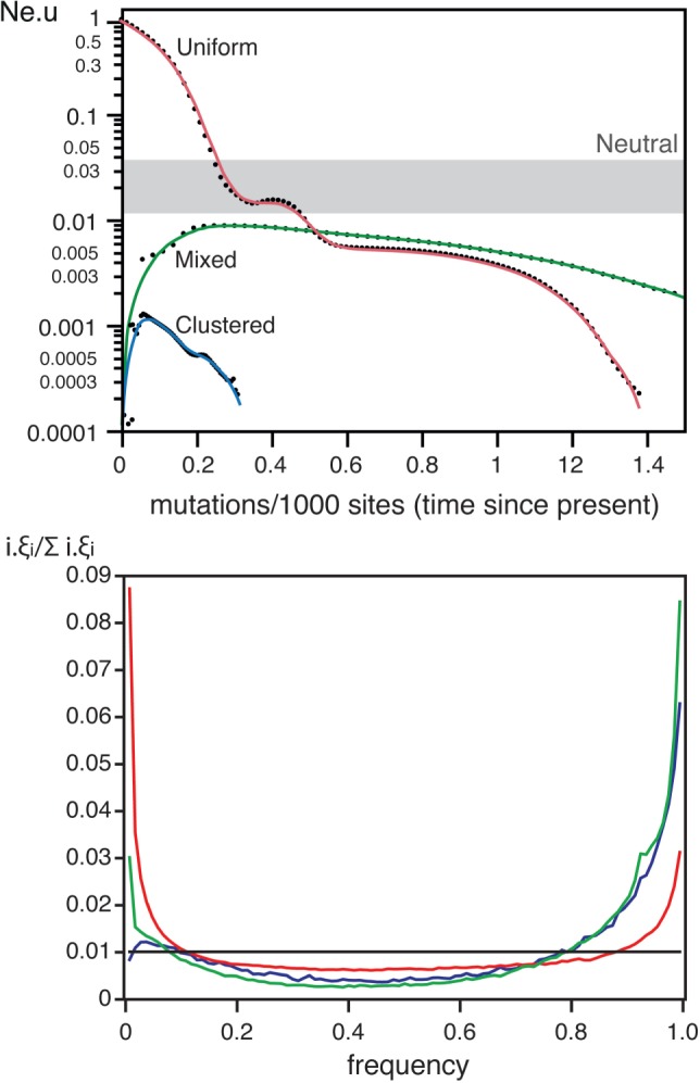
Fig. 6.

Top Skyline plots for clustered, uniform and mixed sampling on simulations with weak selection and recombination (each point is an average of the ten simulations). The grey box indicates the range of variation of the Neutral simulations in figure 1. Bottom Average SFS for the same three datasets (1,000 simulations). Colors match the same datasets in both plots.
