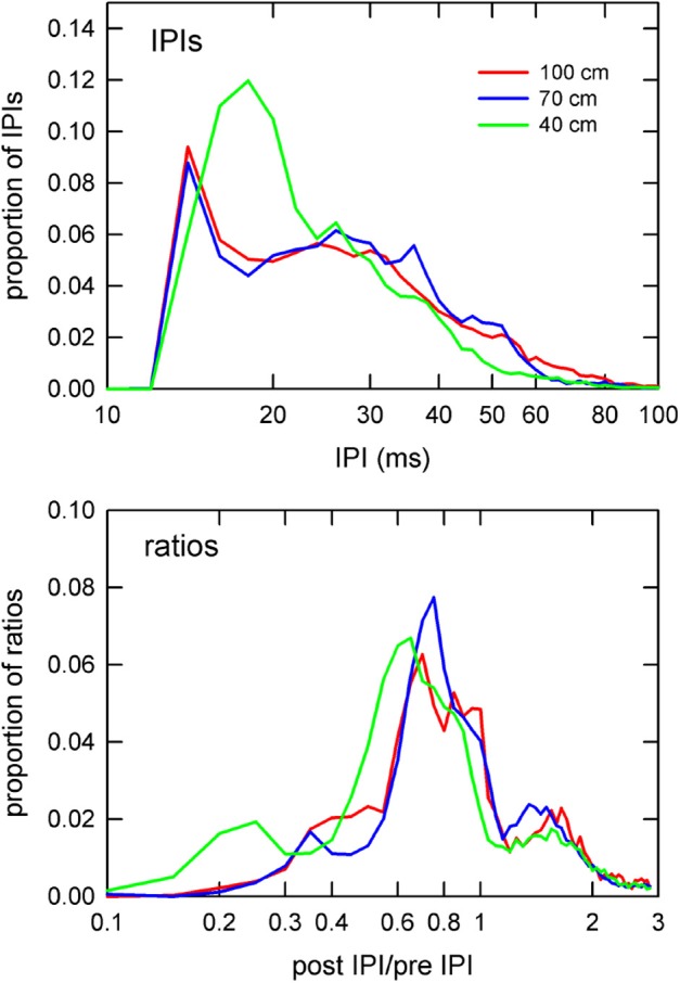
Figure 6.

Distributions of IPIs and IPI ratios. Proportion of IPIs (top panel) and post IPI/pre IPI ratios (bottom panel) by corridor width. IPIs and ratios are plotted on logarithmic x-axes to emphasize differences at the extreme low end of the IPI and ratio ranges. The 40 cm curve (green) shows drastically higher proportions of sounds having 20 ms IPIs (top panel) than in the other corridor widths. Similarly, the 40 cm curve for the ratios shows a shift toward smaller ratio values in comparison to the other widths.
