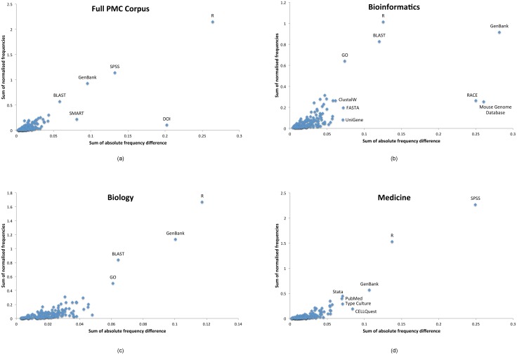
Fig 7. Relative usage variation within the top 100 resources for each of our corpora.
We plot the sum of the normalised frequencies (y-axis; relative resource usage), against the sum of the absolute differences (x-axis; usage variation), with interesting outliers labelled. Data based on resource mentions extracted in the period 2000–2013 inclusive. We filtered out mentions only seen in a single year.

