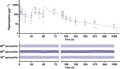
Figure 3.

Plasma concentration vs. time data (upper panel) and normalized prediction‐corrected visual predictive check for plasma piperaquine (lower panel). The solid line in the upper panel represents the average concentration vs. time curve for the present patients overlying individual data points, represented as open circles. The solid and dotted lines in the lower panel represent the normalized observed 50th percentile and its 80% prediction interval (i.e. 10th and 90th percentiles), respectively, within their normalized simulated 95% confidence intervals, represented as grey shaded areas
