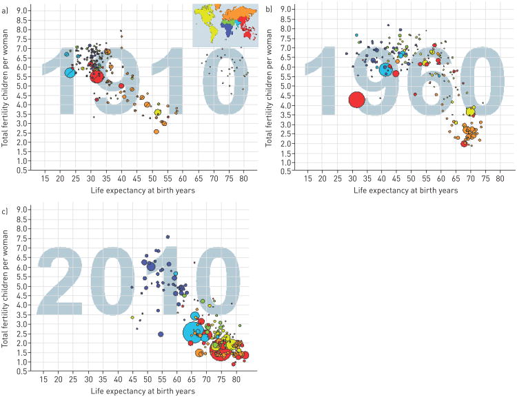
Figure 2.
Relationship of life expectancy at birth in years and fertility (children born per females) at three points of time worldwide. Each dot represents a country, with the size of that dot proportional to the country population. Free material from www.gapminder.org.

