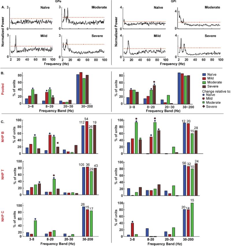
Figure 2. Oscillatory activity varied with motor severity in specific frequency bands within the pallidal segments.
A. Example plots illustrating power spectral density of units in the GPe and GPi with increasing severity. The normalized power spectrum of each unit was computed by dividing by the mean in the 0.5-200 Hz range. The red dashed line indicates the threshold used to identify significant peaks, which was set as three standard deviations above the mean in the 0.5-200 Hz range. A peak within a pre-defined frequency band was considered significant only if two consecutive bins crossed the threshold. B. Bar graphs show the percentage of units pooled across all subjects with oscillatory activity within each frequency band and disease state. C. The percentage of units with theta, 8-20 Hz and high beta activity to those with gamma activity as a function of motor severity for each animal. The numbers of units used in the analysis, for each level of severity and NHP, is indicated over the bars. Filled circle, star, square and diamond symbols indicate significant change relative to naïve, mild, moderate and severe states at an alpha of 0.05 with Bonferroni correction.

