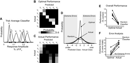
Fig. 2.
Classification of single trials by an ideal observer performed near chance. A: representative example of a trial-average classifier. Black dots represent actual observed trial-average time series peaks and appear in velocity order (closest to origin V1, maximum V6). B: the optimal performance of the classifier shown in A is limited only by the overlap of the velocity response distributions. The probability of classifying an observation from velocity Vj as coming from Vk is represented graphically as element [j, k] in the performance matrix. The presence of a strong diagonal represents a high number of correctly sorted trials. C: the actual performance matrix of the ideal observer given true single-trial response amplitudes. D: distribution of the errors associated with classification. Using the notation described above, the error = j − k. E: the percentage of trials correctly classified under both the optimal and actual conditions across all data sets. Optimal and actual performance from individual data sets are connected with a line. F: the percentage of error trials that are extreme |j − k| ≥ 2 in both the optimal and actual performance conditions.

