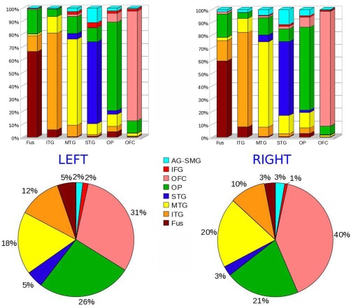
Figure 3.

Top: Bar graphs representing the relative connectivity (expressed in percentage) of each of the 6 segments resulted from the group connectivity‐based seed classification (names reported under the bars) with the 8 regions used as target (names reported in the legend at the center of the figure). Bottom: Total number of connections of the ATLs with the 8 target ROIs (relative distribution). The color code in the graphs is consistent with the color of target ROIs in Figure 1.
