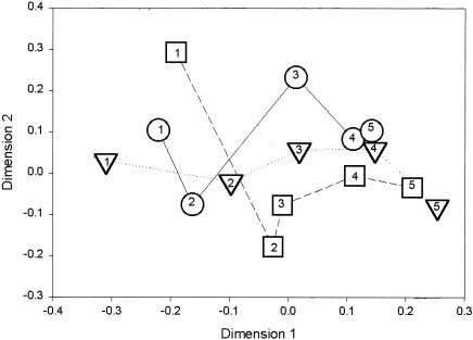
FIG. 2.
Plot of the first and second dimensions of an NMDS analysis. Points represent mean similarities of DGGE patterns between metal treatments and time points. The mean similarity for each treatment was used to reduce the number of individual data points, and only three metal treatment levels are indicated for clarity, thus simplifying interpretation of the NMDS plot. ○, control; ▵, 8% metal treatment; □, 30% metal treatment. Numbers indicate the time points represented by the symbols: 1, 1 week; 2, 2 weeks; 3, 4 weeks; 4, 8 weeks; 5, 12 weeks. Lines connecting symbols are included to clarify changes in community composition for each treatment at each time point and are not intended to indicate the positions of communities at intermediate time points.

