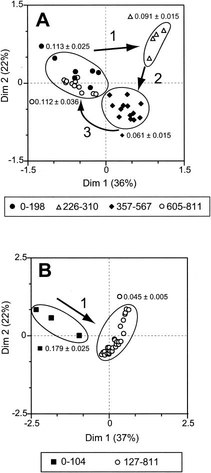
FIG. 6.
CA of T-RFLP data for each reactor community individually. (A) Phenol-fed reactor; (B) phenol-plus-TCE-fed reactor. The numbers next to the symbols under each panel indicate the day periods. The arrows and numbers (1 to 3) in the graphs indicate the order of the changes in community structure. Results from independent digestions with CfoI and HaeIII were combined for the analysis. The circled areas indicate the different clusters. The mean ± 95% confidence interval for the TCE transformation rates for each of the different clusters is indicated next to the circle. Dim, dimension.

