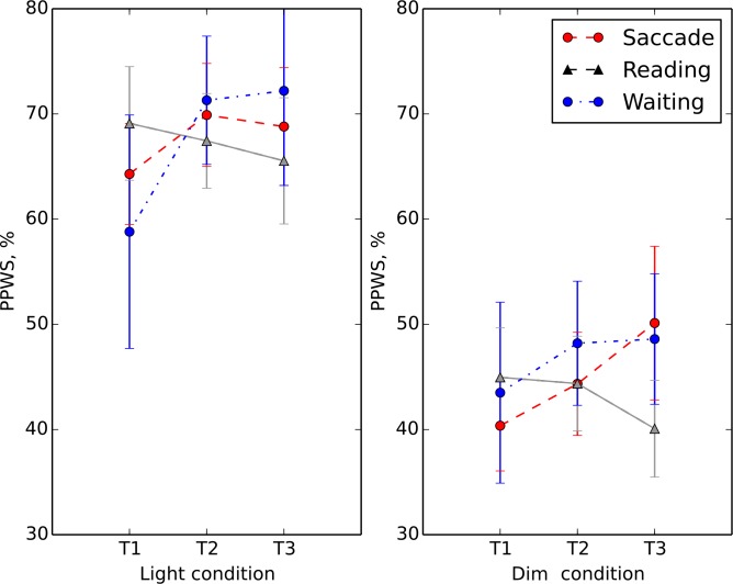
Fig 2. Separate plots present the light (left plot) and dim (right plot) conditions for the saccade (red circles), reading (gray triangles) and waiting list (blue circles) training groups.
The average percentage of preferred walking speed (PPWS) is plotted on the ordinate as function of the different times relative to the training–pre (T1)-, post (T2)- and follow-up (T3). Error bars represent +/-1 SEM.

