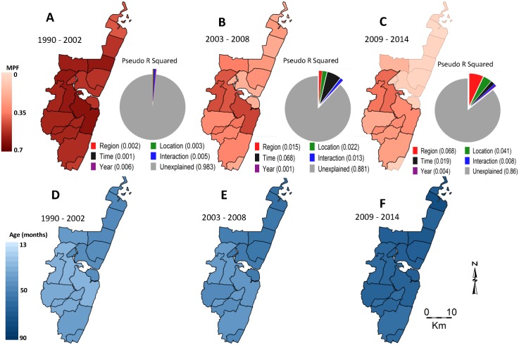
Fig 3. Geographical distribution of MPF and age of slide-positive acute admissions over time.
Panels A, B, and C show spatial distributions of MPF for the predecline, decline, and postdecline periods respectively, and their associated pie charts show the proportion of the variability in MPF explained by the predictors: region (i.e., north versus south), location, time trend (i.e., as a continuous variable), an interaction between time and location, year to year variation (i.e., year as a stratified variable), and the unexplained variations. Panels D, E, and F show spatial distributions of age in months for the slide-positive admissions during the predecline, decline, and postdecline periods.

