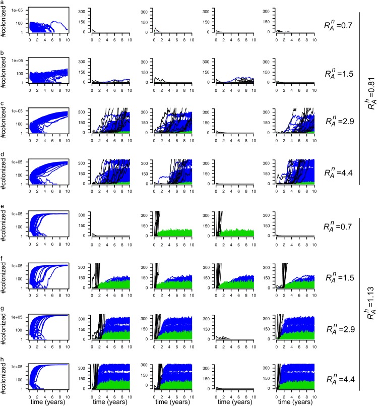
FIGURE 2.
Prevalence of colonization in simulations on the complete hospital-nursing home network, for 8 different combinations of the transmissibility parameters: (a) βh=0.25 and βn=0.005, (b) βh=0.25 and βn=0.01, (c) βh=0.25 and βn=0.02, (d) βh=0.25 and βn=0.03, (e) βh=0.35 and βn=0.005, (f) βh=0.35 and βn=0.01, (g) βh=0.35 and βn=0.02, (h) βh=0.35 and βn=0.03. The graphs in the first column show the total prevalence of colonization over time for 100 different simulations. The other four graphs show the result of individual simulations. Each line shows the prevalence in either a hospital (green), a nursing home (blue) or the community (per province, black).

