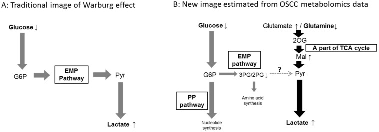
Figure 3.
(A) The traditional image of the Warburg effect; and (B) a new concept based on metabolomic data obtained from OSCC samples. Gray bold arrows: metabolic flows derived from glucose metabolism; Black bold arrows: metabolic flows derived from glutaminolysis; Small arrows with metabolite names: a significant increase (upward arrow) or reduction (downward arrow) in the levels of the named metabolites; See Figure 1 for an explanation of the metabolite abbreviations.

