
Figure 5.
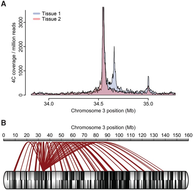
Visualizing 4C data. (A) Especially when interested in local contact profiles, a coverage plot representation of the normalized 4C data may be chosen. Data are from the same locus as the 4C plot in Figure 1. The panel depicts an overlay of contact profiles from two tissues (depicted in blue and orange). An overlay is shown as dark red. (B) Alternatively and when depicting long-range contacts, a “spider plot” or arachnogram can be employed. Contacts from the viewpoint to other regions on the cis chromosome are depicted in brown. Black lines within the chromosome represent genes.