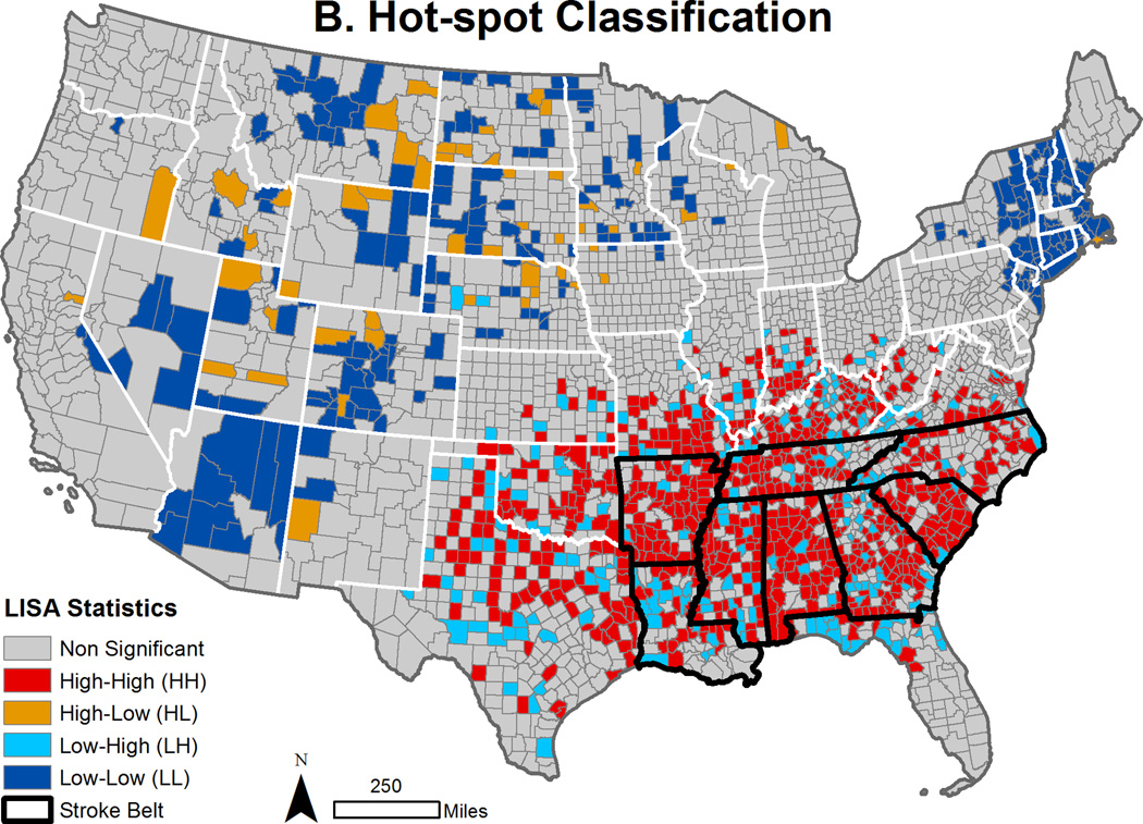
Figure 1. Stroke Mortality Rates and Hot-spots Mapped by County.
Panel A presents a US county map showing stroke mortality rates (2008–2010). Rates are reported per 100,000 persons; binned by quintile. Panel B shows stroke mortality hot-spot classifications. Local indicators of spatial association (LISA) statistics identify counties (significance level p<0.05), as high-high (HH), low-high (LH), low-low (LL), high-low (HL) or not significant. In panels A and B, stroke belt states are outlined in black.


