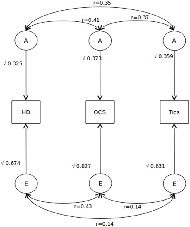
Figure 1.
Path diagram for the best-fitting model. Squaring these paths gives the proportion of variance accounted by each of the A and E components. Also indicated are the correlations among each A and E component for each of the three phenotypes. A indicates additive genetic factors and E indicates non-shared environmental factors.

