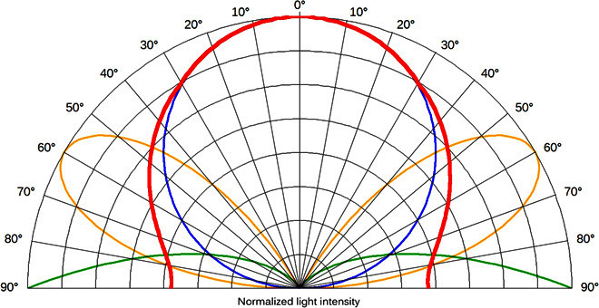
Fig. 1. Upward emission functions used to compute the maps.

The polar graph shows the three different light intensity distributions used to compute the three map versions: the Lambertian distribution with a peak toward the zenith (map A; blue), the function with peak intensity at low angles above the horizon plane (map B; green), and the function with peak at intermediate angles, 30° above the horizon plane (map C; yellow). The thick red line shows the overall best-fitting function.
