
Fig. 2. Velocity variation modeling.
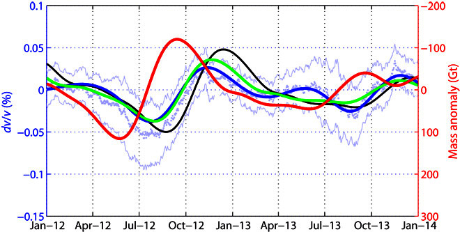
The thick red curve is the ice mass variation corrected from its quadratic trend and filtered in the 4- to 17-month period band. The green curve is the poroelastic modeling of dv/v based on the red curve. The black curve is the result of the viscoelastic modeling. The blue curve is the dv/v measurements averaged over all station pairs and filtered in the 4- to 17-month period, whereas the pale blue dots and the thin pale blue curves are the raw average dv/v measurements and the corresponding average uncertainties, respectively.